
D•One, a new part of ClearScore that helps banks share data, needed a fresh look. Their old brand wasn’t aligned with who they were or what they believed in. They needed a simple yet strong brand to get partners and make money faster.
They wanted:
- A quick update of their current look
- A clear message about who they are
- Good marketing materials for different channels
- To look trustworthy to get partners

Quick start in the market
They looked great at business events and got noticed
Found partners fast
Their clear, professional materials helped them get better partners faster
Team can do more
Now the team can make their own marketing materials without asking designers for help. This means they can work faster on their campaigns.
D•One secures high-profile partnerships 30% faster.
1. Quick audit: Found what wasn’t working in their current brand
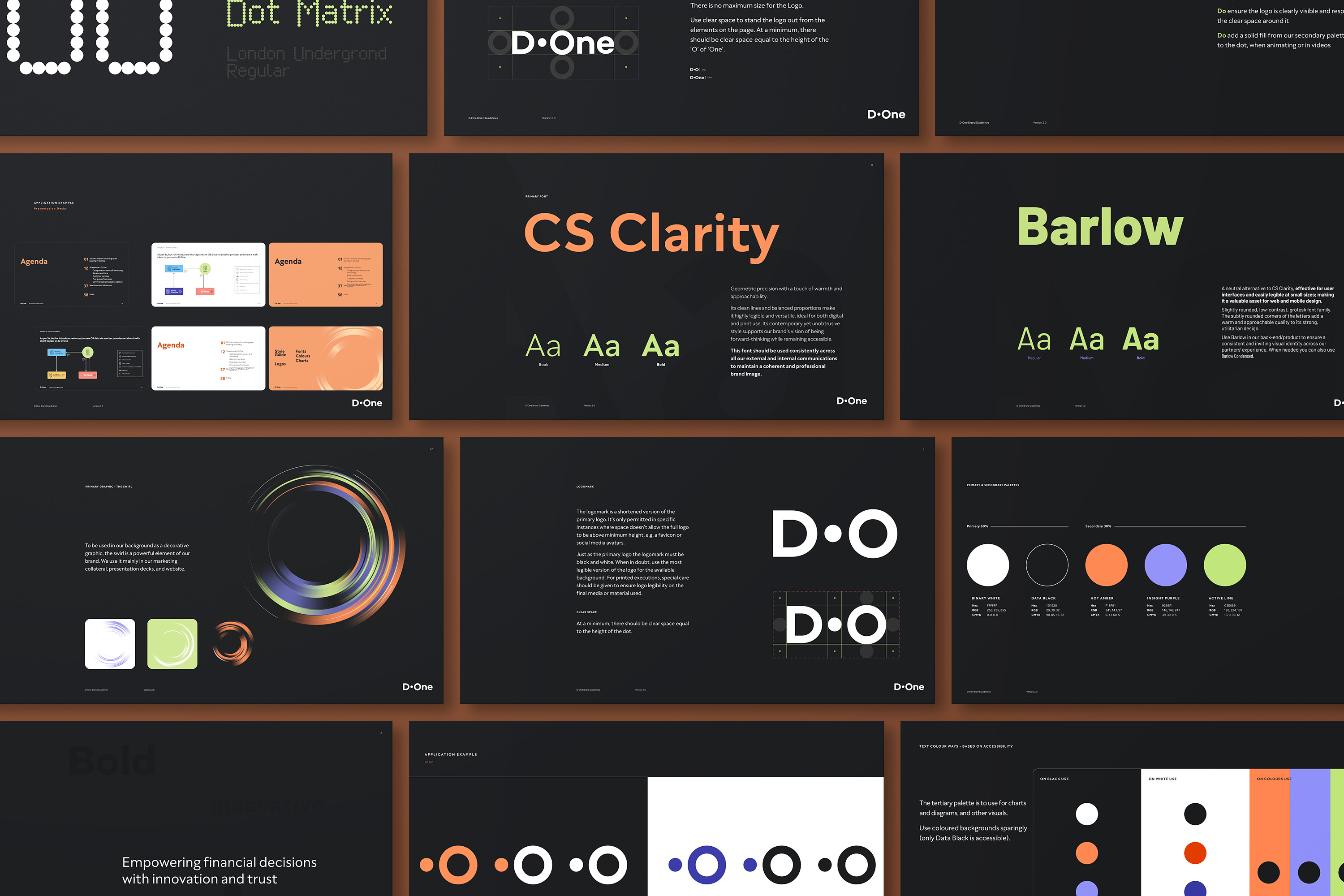
2. Rebrand: Created a black and white design with warm colours that people would remember
3. Easy-to-read fonts: Started with Campton font to look professional, then switched to ClearScore Clarity because it was easier to use
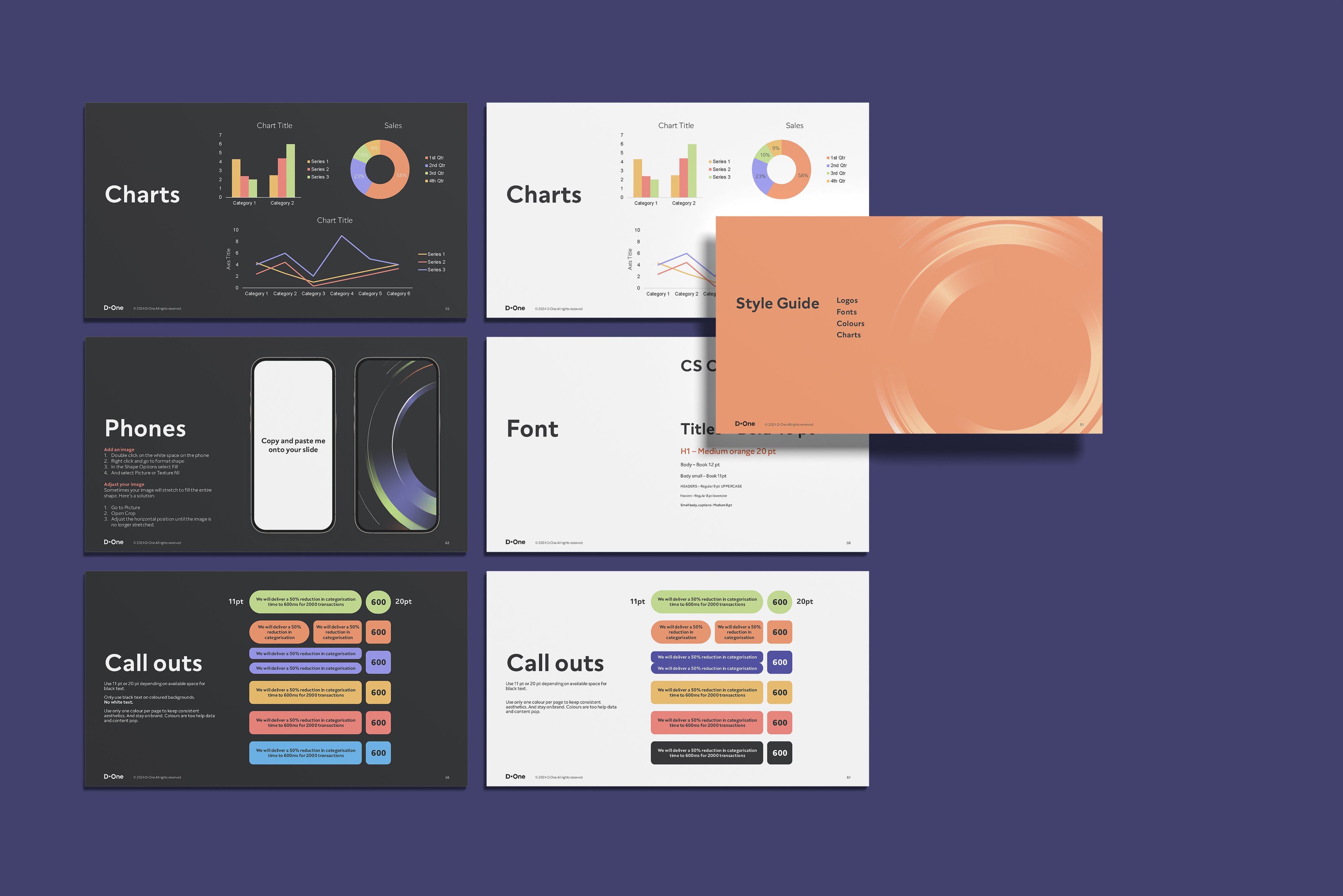
4. Helpful tools: Made guides in Figma and Notion, plus added ready-to-use designs in Dropbox and PowerPoint so the team could make their own materials